The GoTyme logo is
the heart of our system.
An identity alive with
the promise of our brand,
And the strength to lead
in a crowded market.
Informing a unified system down to every detail.
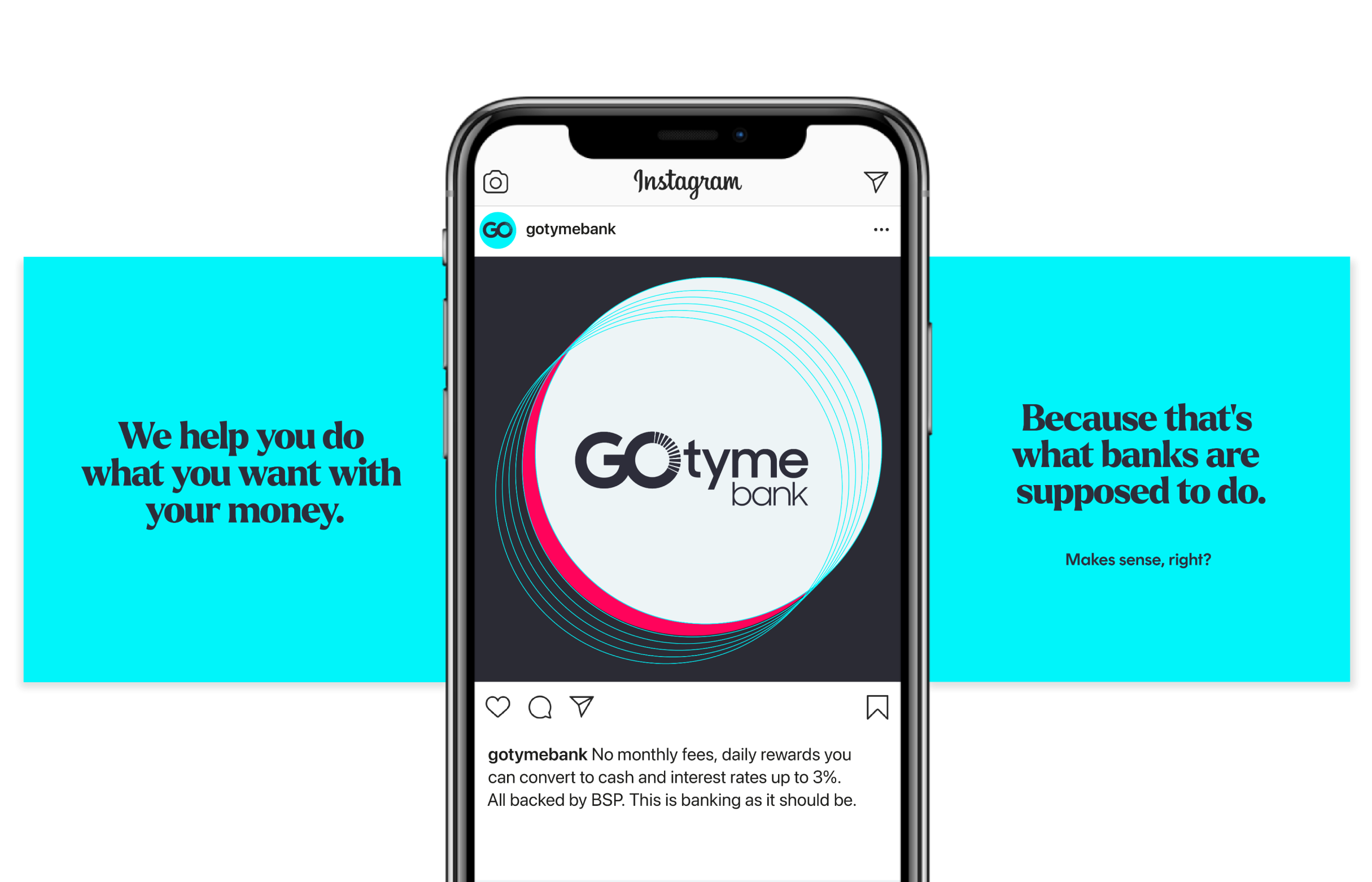
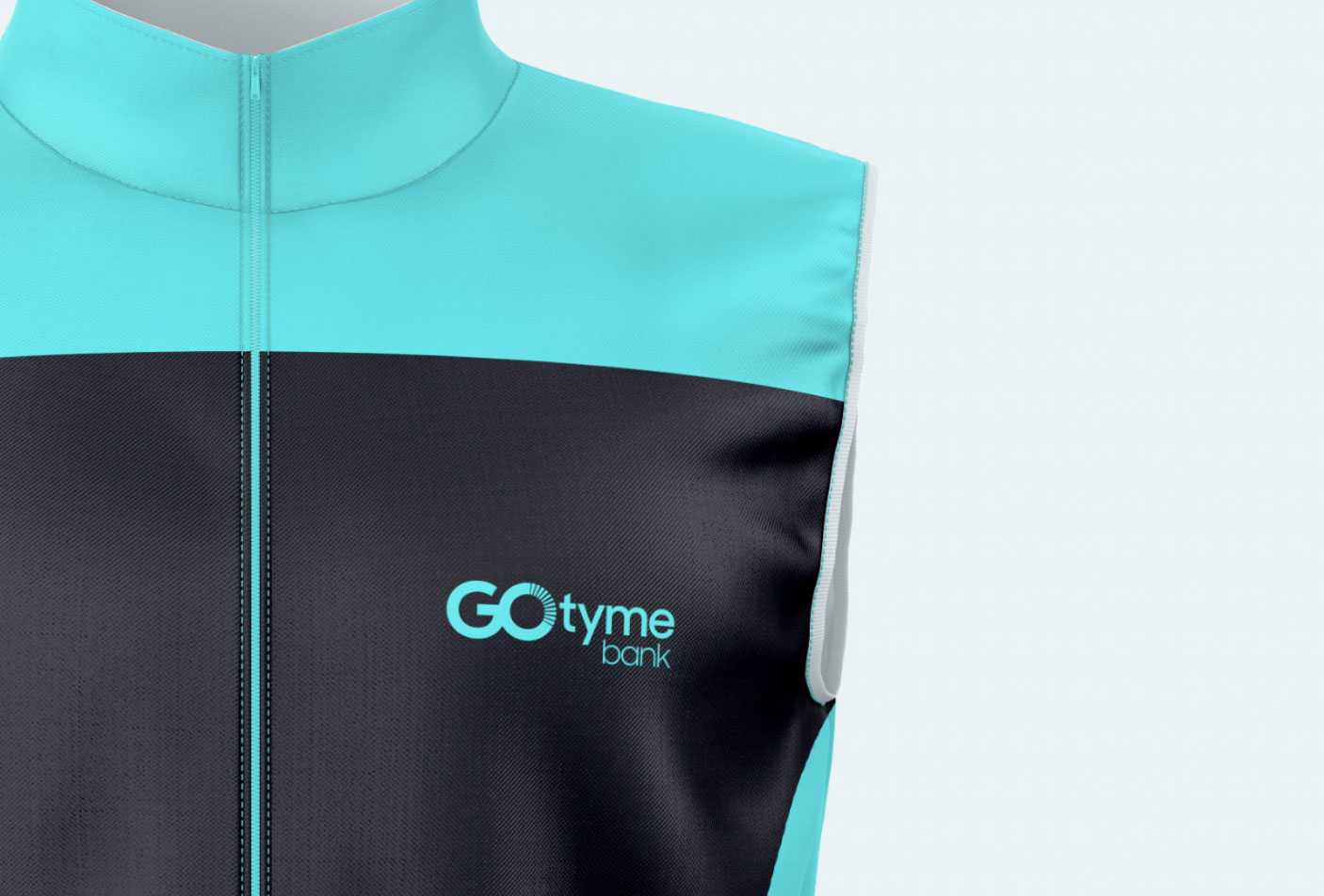
Worn proudly
by our ambassadors.
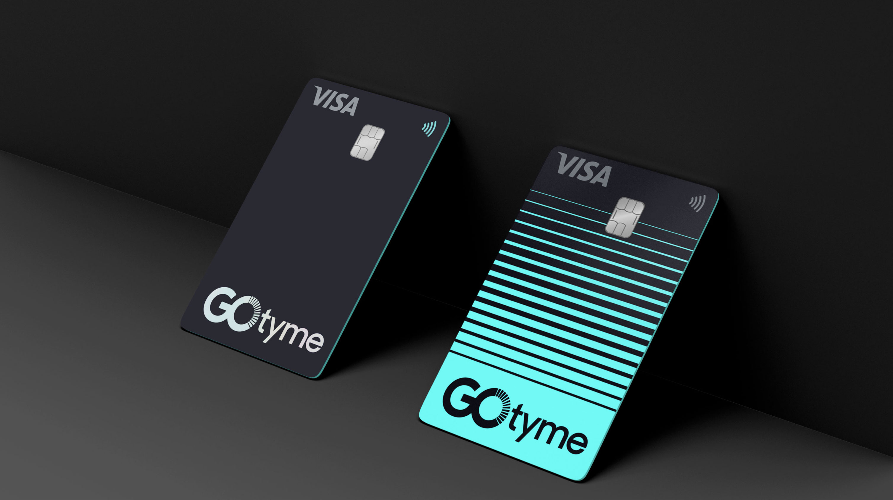
A covetable brand that puts tactile results in the palm of your hand.
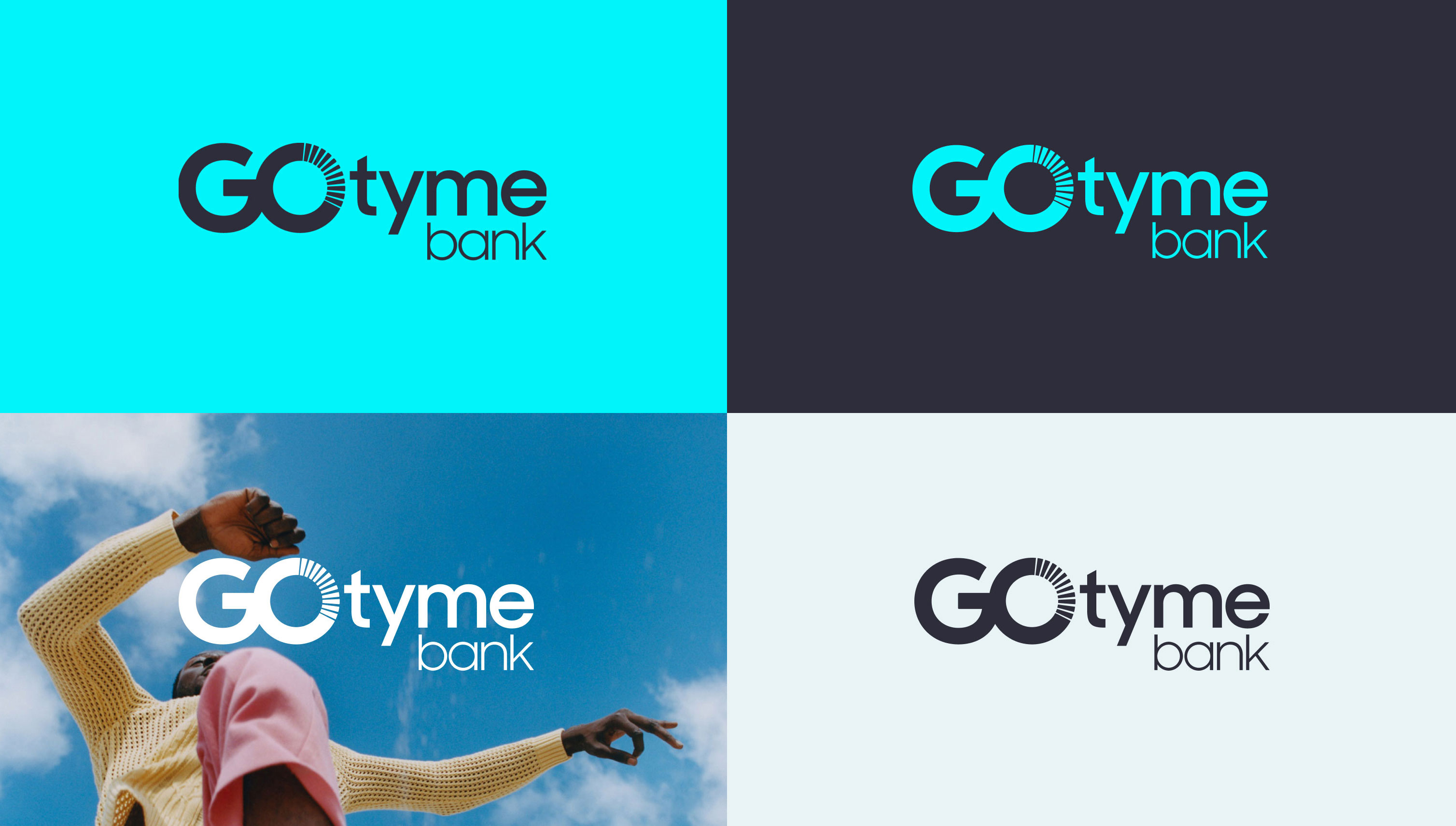
Primary logo
Secondary logo
Clear space rules
Each version of the logo lock-up has
a clear space zone around it. This keeps other graphic elements from making it
too hard to read.
Minimum width = 140px
50%
Minimum width = 140px
50%
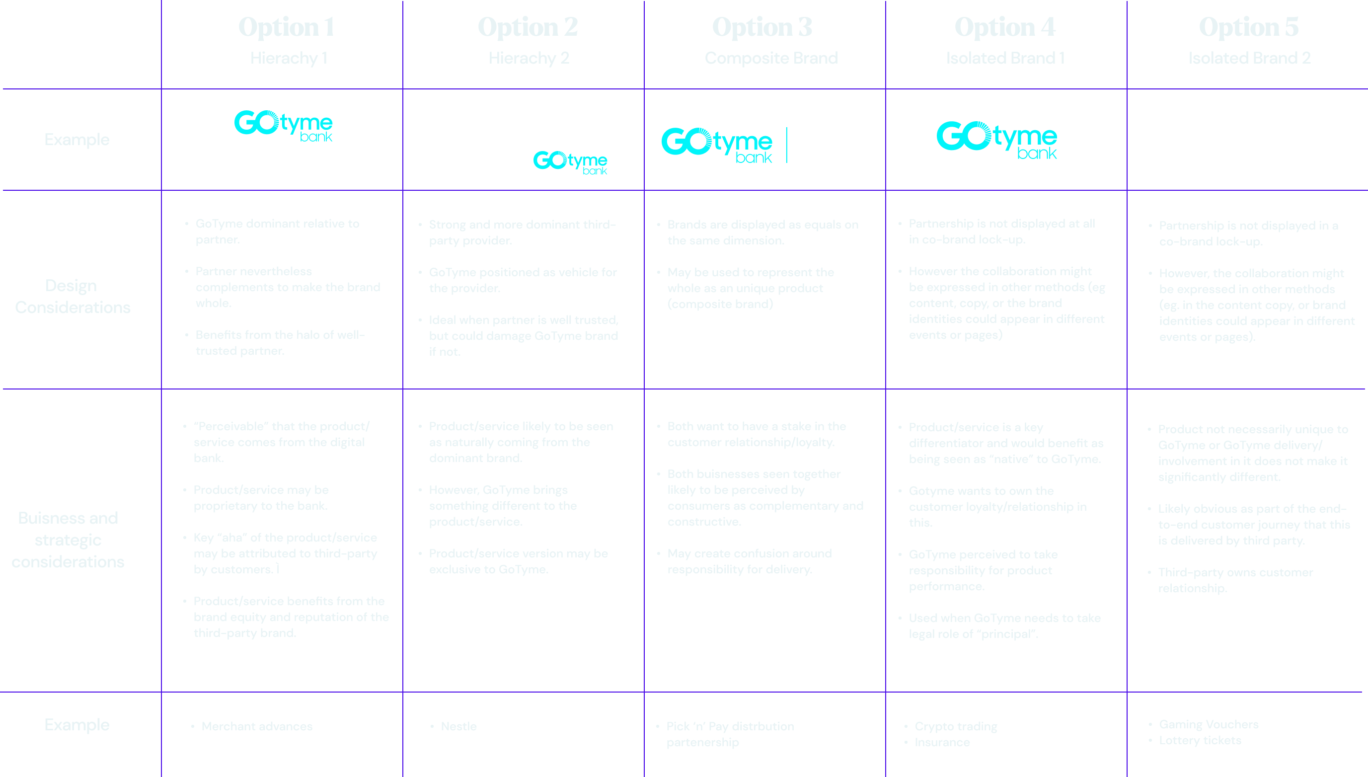
Partnership Logo lock up
Clear spacing in between the lock up logo and the partnership is essential to create hierarchy and clarity even at small scale.
GoTyme shorthand
App icons and social tiles get their own version of our logo - a distinct shorthand
as compelling as it is bold.
App tile
×

Width = 80% of ×
Social profile
×

Width = 70% of ×