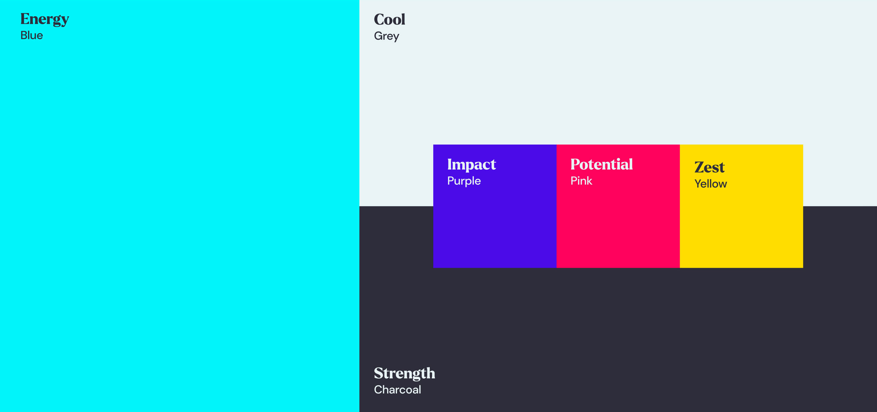
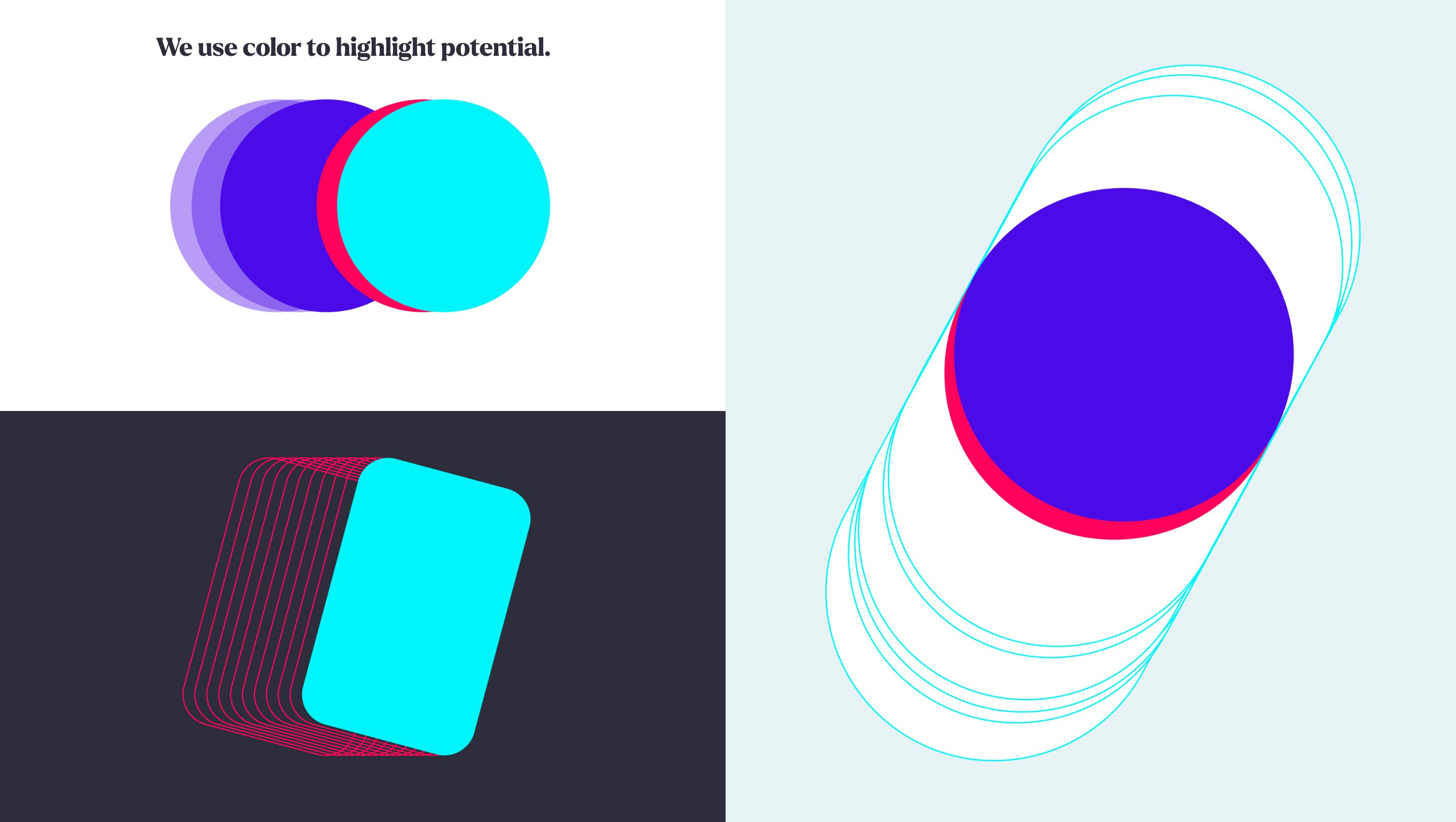
The GoTyme palette has been crafted to stand out from the crowd with its fresh and distinctive range. We lead with the primary palette, but our secondary palette is just as important.
We lead with Blue supported by Charcoal and Grey.
Add a splash of the secondary palette to create energy and pace.
Transparencies help add depth and create a sense of movement.
No more than 4 layers.
Equally spaced layers of transparent hero colour fill.
Transparency colour should match the infill colour and contrast the graphic keylines.ore than 4 layers.
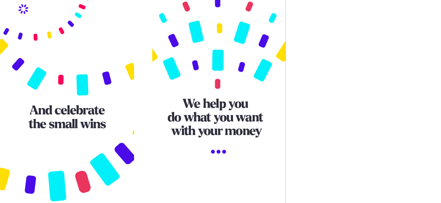
A hint of yellow brings warmth and joy to moments of celebration.
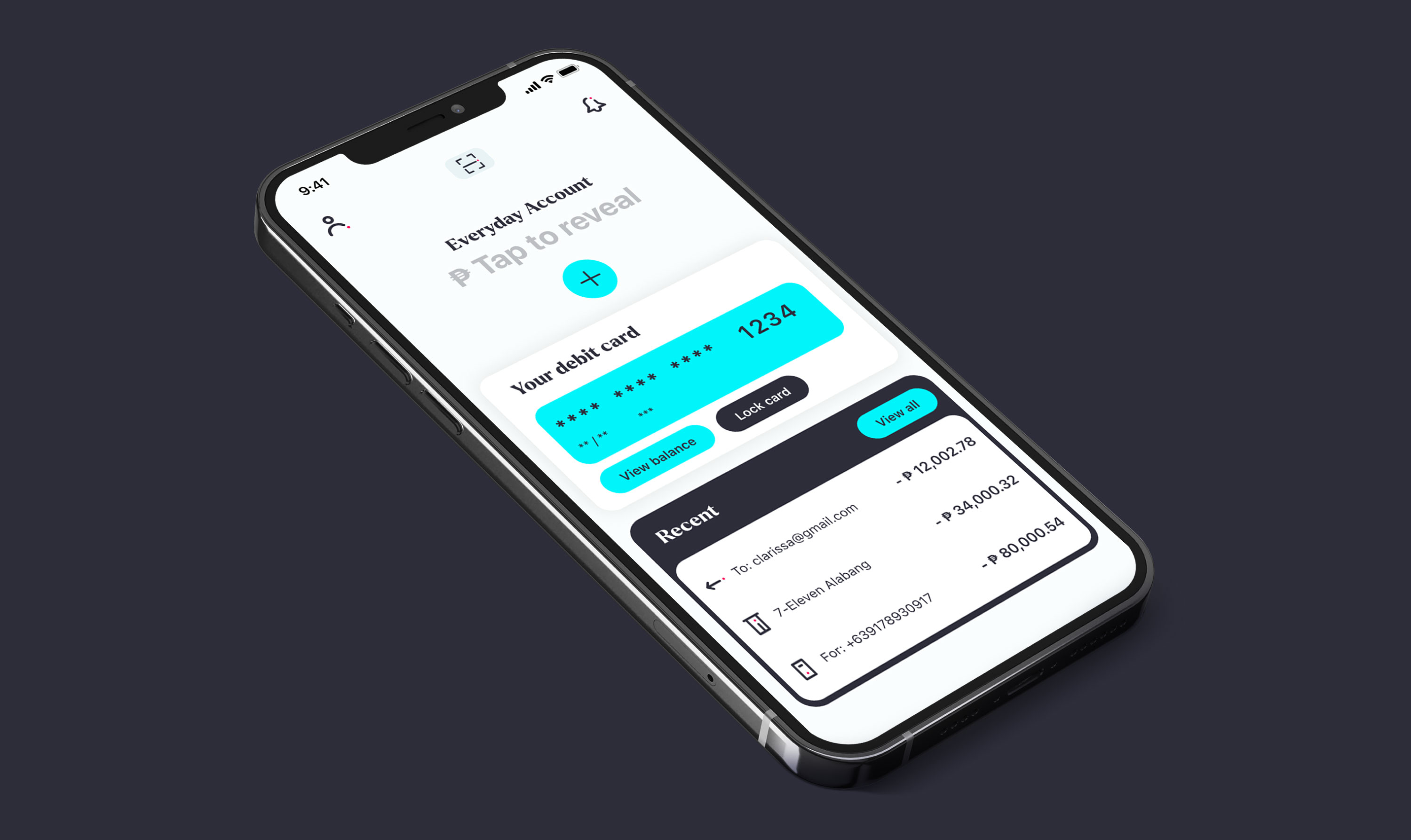
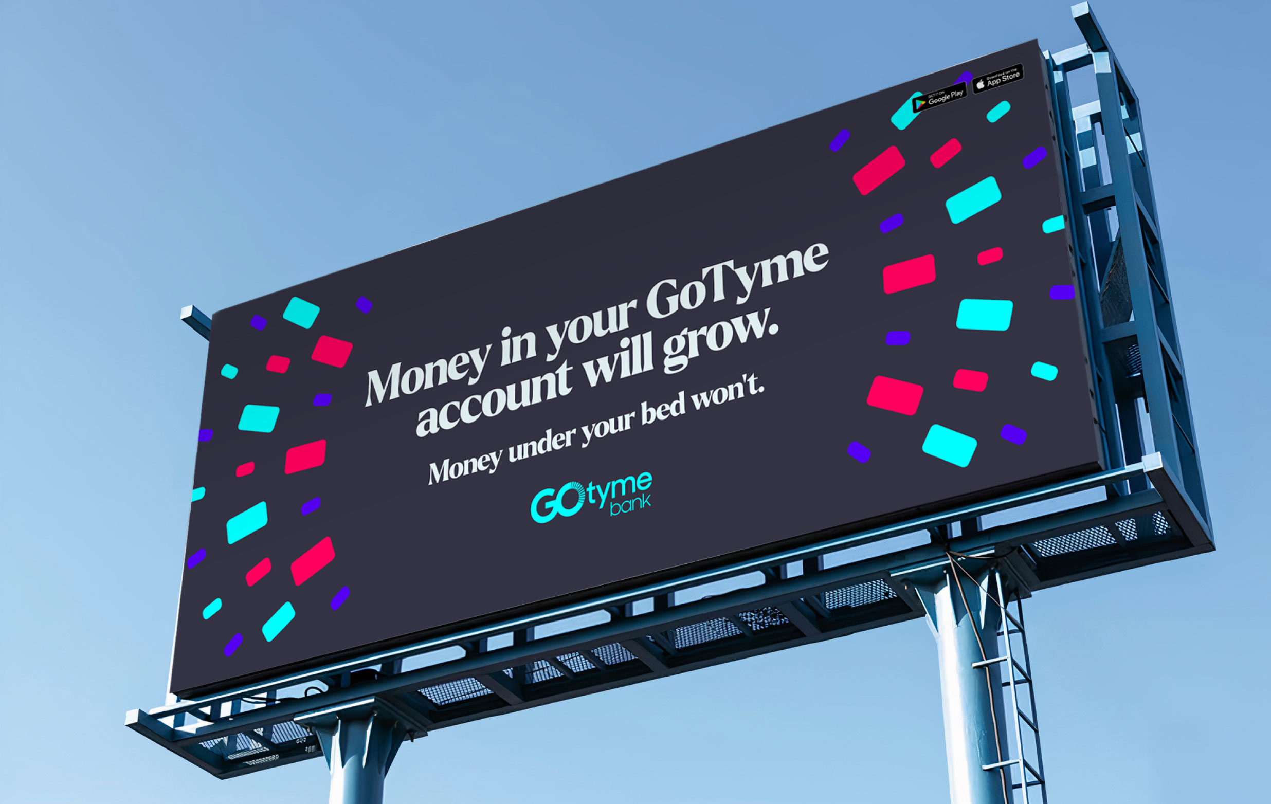
Our palette brings the product to life with positive energy